
Piet Streicher PhD Engineering
Introduction
The Western Cape is approaching peak mortality rate for Covid-19 and should reach this point before July 7. This prediction is based on the most up to date information emerging in the Western Cape. Most countries follow a consistent trajectory which can be modelled mathematically and then used for short term predictions.
In this paper, Brazil was selected as an illustration of a country that is slightly ahead of South Africa. The same mathematical model was fitted to both Brazil and South Africa. Cumulative deaths and the peak mortality rate from Covid-19 can be modelled using the Gompertz curve. It is an S shaped curve that starts off with exponential growth, then slows down until the slope is more linear, then tapers off and levels out towards a ceiling level (asymptote).
The point with the steepest slope represents the peak mortality rate. Once this point is passed, less people will be dying each day and the hospital and ICU bed occupancy will decrease. From this turning point accurate predictions of total deaths from Covid-19 can be made.
As a sanity check, the predicted peak mortality rate for the Western Cape was compared to other regions in the world. The implications of the Western Cape experience for South African mortality predictions were considered.
Gompertz function
The Gompertz function is a sigmoid function which describes growth as being slowest at the start and end of a given time period. The right-hand or future value asymptote of the function is approached much more gradually by the curve than the left-hand or lower valued asymptote. The Gompertz function is widely used to model Covid-19 cases and deaths (Torrealba-Rodriguez et al., 2020) (Levitt et al. 2020).

where
• a is an asymptote, since
• b sets the displacement along the x-axis (translates the graph to the left or right). Symmetry is when b = log (2).
• c sets the growth rate (y scaling)
• e is Euler’s Number (e = 2.71828…)
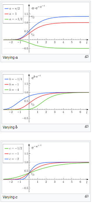
Figure 1: Gompertz curves and Gompertz constants (Wikipedia)
The Gompertz curve was fitted to SA and Brazil data in Excel using the method described in this tutorial:
https://www.youtube.com/watch?v=x-C_8t-_Lc4&t=637s
The constants a, b and c were then manually adjusted for a better fit.
Modelling mortalities in Brazil using the Gompertz curve
Brazil is approximately three weeks ahead of South Africa (SA) in terms of the Covid-19 pandemic. Brazil was used mainly to illustrate the trajectory of a country that is slightly ahead of SA.
Brazil was also chosen as it has several similarities to SA. Brazil has a similar age demographic and GDP per person to SA. Brazil has a warm climate with several large cities in the Southern Hemisphere which follow the same seasons as does SA. Note however that none of these parameters such as age demographics or climate were used in this analysis. This analysis is purely based on the trajectory of the cumulative deaths curve.
On June 9, Brazil had only tested 4 706 people per million. On the other hand SA had tested 16 335 per million. This could partly explain the higher case fatality rate (CFR) in Brazil of 5.2% as Brazil only tests those with severe Covid-19 symptoms. South Africa has a consistent CFR of 2.2%. Italy had a CFR of 8.6 % on March 20, almost 4 times higher compared to SA. Again, the CFR was not used in this analysis as this analysis only modelled fatalities.
From figure 2 we can see that Brazil has reached a peak mortality rate at 984 deaths per day on average. Note the large variation in daily figures, especially towards the peak. While the average peaked at 984 deaths per day, the highest number recorded in a single day was 1 491 on June 5. The lowest recent numbers were 355 on June 9 and 480 on June 1.
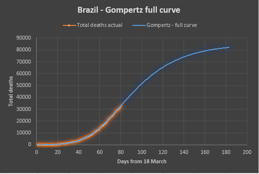


Figure 2: Modelling deaths in Brazil using Gompertz curves.
Projecting the Gompertz curve into the future predicts 82 000 deaths for Brazil after 180 days. Brazil is a country with a population of 210 million people. This works out to a peak mortality rate of 4.7 deaths per million per day and a total death toll of 39 people per million.
Modelling mortalities in the Western Cape using the Gompertz curve
Two Gompertz curves where fitted to the Western Cape data, one conservative upper bound curve and another optimistic lower bound curve (figure 3).

Figure 3: Conservative and optimistic curves fitted to WC actual data.
From figure 4 cumulative deaths follow a relatively tight envelope that can be used for short term projections.
From figure 5 and table 1 we can see that the Western Cape could reach a peak mortality rate between June 23 and July 7 at a level of between 44 and 59 deaths per day. Projecting the Gompertz curve into the future predicts between 3 500 and 5 000 deaths for the Western Cape after 180 days (April to September).
For any one day the daily deaths number can be significantly above or below the curve as a death can only be counted once the positive Covid-19 test result is recorded (figure 5). Currently there is a 5day delay in test results on average. Recent numbers include 15 deaths recorded on June 6 and 75 deaths recorded on June 7.
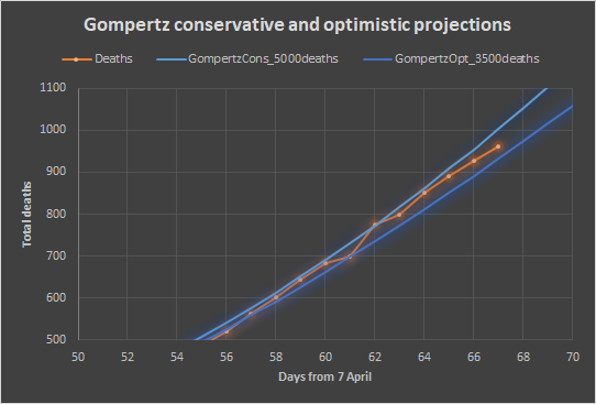
Figure 4: Zooming in on the last few days – 927 deaths on June 11.

Figure 5: First derivative of Gompertz curves with actual daily deaths.

(Figure 5 update on 11 September.)
The Western Cape has a population of 5.81 million people. This works out to a peak mortality rate of 7.6 to 9.8 deaths per million per day and a total predicted death toll of 603 to 837 people per million. Note that the Western Cape is the worst affected region in South Africa and should rather be compared to similar regions in the world. The worst affected region in the world is New York State which is likely to end up with 1 800 deaths per million after 180 days, 2-3 times higher compared to this prediction for the Western Cape. This comparison is made as a sanity check. Any analysis that predicts a higher death toll compared to New York would need immediate scrutiny.

Table 1: Gompertz optimistic and conservative predictions for Rt=1 for deaths.
Hospital beds and ICU beds also reaching a peak
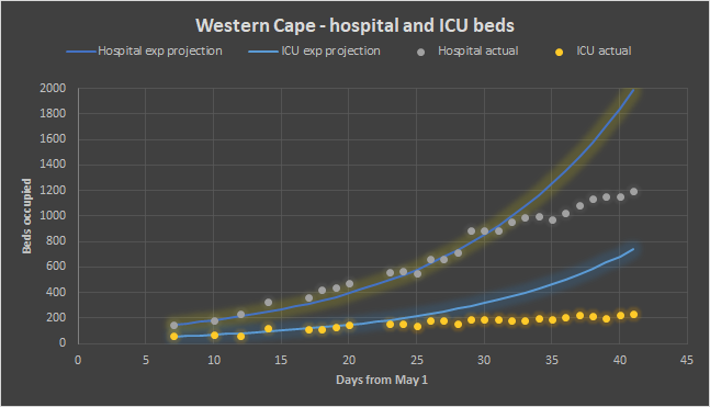
Figure 6: Hospital beds and ICU beds in the Western Cape
The increase in hospital beds and ICU beds occupied in the Western Cape has already slowed down significantly and will start to decrease around the same time or before a peak mortality rate is reached (see figure 6). The Western Cape is highly unlikely to ever need more than 300 ICU beds and 1 700 hospital beds. The original predictions by SACMC of 3 000 to 6 000 ICU beds needed, and 8 500 to 17 500 hospital beds needed in the Western Cape was out by an order of magnitude.
Total mortality predictions for South Africa
My initial prediction on May 14 of the total mortality for South Africa (SA) was 11 000 deaths (Streicher, 2020). This prediction was based on the experience of Italy with adjustments made based on the age demographic differences between the countries. It assumed a similar level of infection and similar risk for similar ages. The adjustment for our younger age was validated by comparing the CFR of each country.
The Western Cape makes up 10% of the population of the country. The above prediction of 11 000 would therefore translate to a prediction of 1 100 deaths in the Western Cape. This prediction is now clearly an underestimate, with 927 deaths on June 11 and the daily deaths at 41 and increasing. This paper predicts a total death toll for the Western Cape of 3 500 to 5000.
Each country has a hotspot with a higher death toll and normally this hotspot reaches a peak mortality rate first. The Western Cape has a CFR of 2.5% while the rest of the country has a CFR of 1.6%. In the Western Cape 0.6% of the total population have already tested positive, while only 0.04% have tested positive in the rest of the country. The low CFR and infection rate for the rest of the country might well indicate an increased resistance to Covid-19. This could potentially be explained by the large number of people in SA living at altitude (> 1 000 m). Gauteng has 12 million people most of which live between 1 300 and 1 700 m above sea level. Gauteng is the largest metro in SA and includes almost half of the urbanised population of SA. Studies have shown that altitude reduces the risk of Covid-19 (Arias-Reyes et al, 2020).
It is therefore plausible that the rest of South Africa could have significantly lower fatalities from Covid-19. At this stage there are no indications that the original prediction of 11 000 deaths for SA (Streicher, 2020) should be significantly adjusted.
- July 30 update! At this stage the best estimate for total deaths for SA is 19 000 deaths. The best estimate for the Western Cape is 4 000 deaths.
Conclusion
The Western Cape will reach a peak mortality rate between June 23 and July 7 at a level of between 44 and 59 deaths per day on average. This trend is mirrored by hospital beds and ICU beds occupied. Once the Western Cape reaches a peak mortality rate it becomes possible to do an accurate prediction of the total deaths expected in the Western Cape. At this stage the prediction is between 3 500 and 5 000 deaths between April and September.
The total Covid-19 deaths for SA predicted at 11 000 (Streicher, 2020) and at 10 000 by Panda (Davis, 2020) remains a reasonable number based on the low infection rate and low CFR for the rest of the country.
- July 30 update! At this stage the best estimate for total deaths for SA is 19 000 deaths. The best estimate for the Western Cape is 4 000 deaths.
Disclaimer
There are always uncertainties in predicting the future. This analysis is a best attempt and may contain errors. Please notify the author if any error is spotted and it will be corrected. For more regular updates, follow www.facebook.com/masksforallsa
Acknowledgements
Thanks to the Western Cape Department of Health in answering all my questions. Thanks to Panda (Pandemic Data and Analysis – https://www.pandata.org.za/) for all the input provided to this paper. The views expressed in this paper are my own and are not necessarily supported by these parties.
References
Arias-Reyes, C., Zubieta-DeUrioste, N., Poma-Machicao, L,,Aliaga-Raduan, F.,Carvajal-Rodriguez, F., Dutschmann, M., Schneider-Gasser, E.M., Zubieta-Calleja, G., Soliz, J., 2020. Does the pathogenesis of SARS-CoV-2 virus decrease at high-altitude? Respiratory Physiology & Neurobiology
Volume 277, June 2020.
Davis, R. 2020. Government projections on SA Covid-19 fatalities questioned by private research group. Daily Maverick 3 June 2020.
Gompertz function – Wikipedia:
https://en.wikipedia.org/wiki/Gompertz_function
Gompertz method in Excel – tutorial:
https://www.youtube.com/watch?v=x-C_8t-_Lc4&t=637s
Levitt M., Scaiewicz A.,1, Zonta F., June 2020. Predicting the Trajectory of Any COVID19 Epidemic From the Best Straight Line. medRxiv preprint doi: https://doi.org/10.1101/2020.06.26.20140814
Streicher, P.E. 2020, Covid-19 A call for smart mitigation measures considering the reduced risk for South Africa from Covid-19. Blog article:
https://mymaskprotectsyou.com/2020/05/14/covid-19-a-call-for-smart-mitigation-measures-considering-the-reduced-risk-for-south-africa-from-covid-19-2/
Torrealba-Rodriguez O., Conde-Gutiérrez R.A., Hernández-Javier A.L., May 2020. Modeling and prediction of COVID-19 in Mexico applying mathematical and computational models. Chaos, Solitons and Fractals 138 (2020). Elsevier.
Western Cape Covid-19 dashboard
https://coronavirus.westerncape.gov.za/covid-19-dashboard
Worldometer – Covid-19 data source:
https://www.worldometers.info/coronavirus/

Good Day
I have looked at the the SA data for both confirmed cases and deaths to try and determine the effect of the non-medical interventions intended to “flatten the curve” on the progression of the epidemic. My conclusion is that only the initial measures, taken on 18 March (close borders, limit size of gatherings, encourage social distancing, limitations on restaurants and bars, etc.), had any noticeable effect, which became visible in the infection data 9 days later on 27 March in a terms of a reduction in the infection rate and also in the deaths 20 days (17 April) after the initial measures. By chance this reduction in the infection rate coincided with the start of level 5 lockdown on 27 March and the government is claiming that this reduction is due to the lockdown. This is obviously impossible due to time delays between infection and detection
and infection and death. The subsequent changes to level 4 and then to level 3 have not effected (i.e. increased) the slope of the exponential progression of the epidemic, as is clear when the data is plotted on a log scale.
I have tried to communicate these conclusions to various parties engaged in convincing/forcing the Government to disband the lockdown, but no one seems interested in using it. Is this because I am wrong in my analysis or because it is a politically incorrect message?
Gottlieb van der Merwe (Beng Hons Elec US)
LikeLike
Thanks Gottlieb, you are absolutely correct. Panda (Pandemic Data & Analytics – http://www.pandata.org.za ) has also tried to communicate this to Government. We have to just keep on trying.
LikeLike